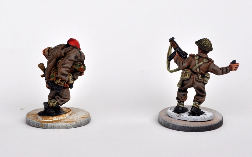
Captain Charles Upham (and the Para again)
Hi there! This is just a quick update to show you I’m finally working on producing better quality pictures. They’re still far from perfect but at least they’re bright and sharp enough to give you an idea of what’s going on. I’ve done a lot of painting lately which I haven’t all been able to show you, but I’ve annexed my girlfriend’s camera for the weekend so I’m trying to catch up. So here goes – I’ve painted all the WW2 models I possess at the moment, and I thought I’d show you all of both of them!
You’ve seen the Para before, obviously, and I’ve talked about his paintjob already. That does mean I have little to say about Captain Upham’s paintjob – it’s identical in all aspects but a few. For instance, upon having painted both the fatigues and the thompson’s wooden stock and grip, I found the two hues to be too similar, so I washed the wooden bits with reikland fleshshade to get some more red in there. As well as this, the model’s lower lip was highlighted just like the rest of the face (which is what I usually do) but I tried out a carroburg crimson wash on it and I have to say I’m satisfied. I didn’t want to end up with a lipstick effect, after all!

Basing will have to wait until I can spend some cash on various tufts at Crisis next weekend – I want to do right by these lads!
So there you go with the WW2 stuff for now. More will follow soon enough, as I’ll be returning from Crisis with around forty paras. More blog updates will happen this weekend, so check back soon!

I really like the colour schemes mate! the use of drab colours and the camouflage makes them look suitably nasty for para’s in the field, trust me on that.
I just have one little issue (my Asperger syndrome seems to be playing up): to me the beret looks a bit too redish. If I’m not mistaken, the original colour was the so-called ‘maroon’… But really, that’s just me being stuck up. You did justice to those amazing sculpts!
Point taken, bro. I’ll try another purple wash or two on the beret and shoulder patch.
Looking awesome! It’s really hard (I think) to get a good variance of colours on minis like these without also making it too much of a contrast – but you’ve managed to make these guys come up so well!